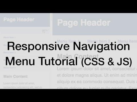
Responsive Web Design Navigation Menu Tutorial
Taha GÖÇER
About this course
In this course, you'll learn how to create a responsive website navigation menu that adapts to different screen sizes using CSS and JavaScript. We'll cover key concepts such as media queries, dynamic styling, and utilizing jQuery for interactive elements, ensuring that your navigation remains user-friendly on both desktop and mobile devices.
What you should already know
Basic knowledge of HTML, CSS, and JavaScript is required before taking the course.
What you will learn
By the end of this course, learners will be able to implement a fully responsive navigation menu that enhances user experience across various devices.