Responsive Web Design Tutorial and Explanation
Taha GÖÇER
About this course
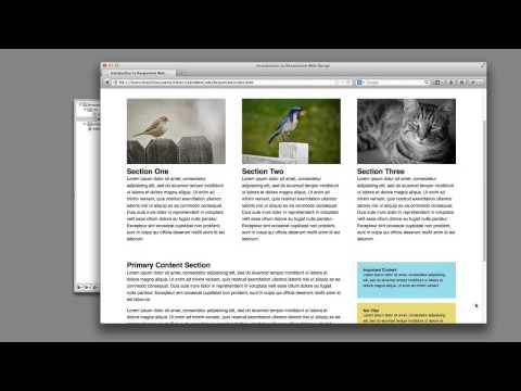
This comprehensive tutorial introduces responsive web design, emphasizing the importance of media queries to adapt layouts for various devices. Learners will explore practical demonstrations, coding techniques, and strategies for optimizing web pages for smartphones, tablets, and desktop screens, ensuring a seamless user experience across all platforms.
What you should already know
Basic knowledge of HTML and CSS is recommended before taking this course.
What you will learn
By the end of this course, learners will have a solid understanding of creating responsive layouts using media queries, ensuring their web designs are functional and visually appealing on any device.